
Most print-on-demand sellers learn the hard way that uploading more designs doesn’t lead to more sales. It just creates clutter—a messy, chaotic storefront full of ideas that never took off.
A successful POD store isn’t about volume. It’s about clarity and focus.
This guide gives you a clean, 5-step method to cut the noise, spotlight your strongest listings, and rebuild your shop into something buyers instantly trust.
Why Bigger Isn’t Better
Large catalogs feel productive but quietly hurt your performance:
- Too many choices overwhelm buyers.
- Unfocused stores confuse new visitors.
- Algorithms spread impressions thin across hundreds of listings.
- Maintaining a huge shop drains time and energy.
A slimmer catalog does the opposite. It creates direction, boosts conversions, and makes your shop feel like a real brand—not a dumping ground for ideas.
Before You Start: Export Your Data
Export your last 90 days of analytics. You’ll use this data in every step of the process.
Step 1 — Identify the Dead Weight
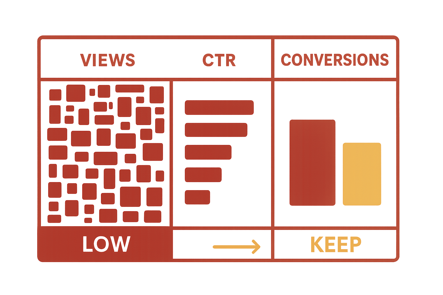
This is where you remove the listings dragging your entire store down.
Audit the Last 90 Days
Check:
- Views
- Click-through rate
- Conversion rate
- Favorites / add-to-carts
- Sales
A listing with impressions but no conversions isn’t resonating. A listing with no impressions isn’t being surfaced.
Both hurt you.
Use Clear Cut/Keep Rules
- Under 50 views + no sales → remove or rework
- Very low CTR → thumbnail issue
- Traffic but zero conversions → cut immediately
Removing weak listings strengthens your shop’s overall engagement signals.
Step 2 — Circle the Winners
These listings become your foundation.
Spot Your High Performers
Look for:
- Consistent sales
- Strong conversion rates
- High favorites
- Repeat engagement
These designs show you what buyers truly want.
Build on What Works
Instead of guessing:
- Make variations
- Explore sub-niches
- Create matching designs
- Expand to related products
You’re not starting from scratch—you’re multiplying success.
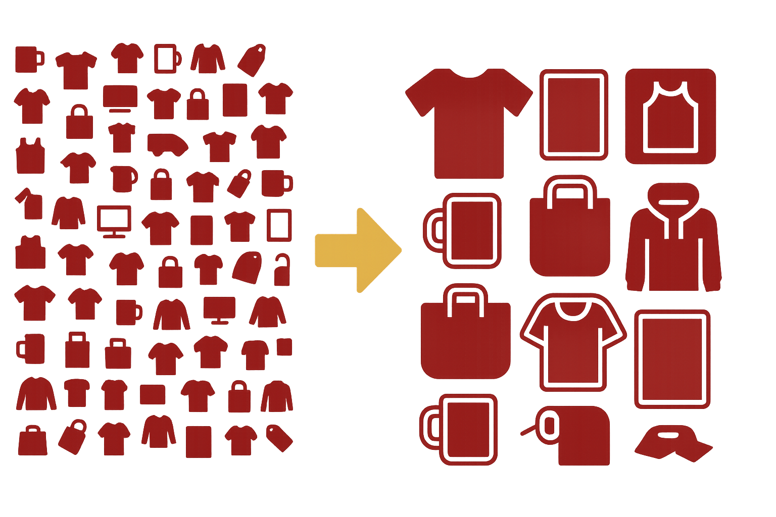
Step 3 — Build a Tight, Branded Core Catalog
Now your shop becomes cohesive instead of chaotic.
Aim for 12–20 Intentional Listings
This range is:
- Easy to browse
- Easy to maintain
- Strong for branding
- Clear for first-time visitors
A buyer should understand your shop’s identity within a few seconds.
Create Simple, Focused Collections
Examples:
- Pet-themed designs
- Minimal home décor
- Outdoor lifestyle graphics
- Humor and quotes
Collections make navigation effortless.
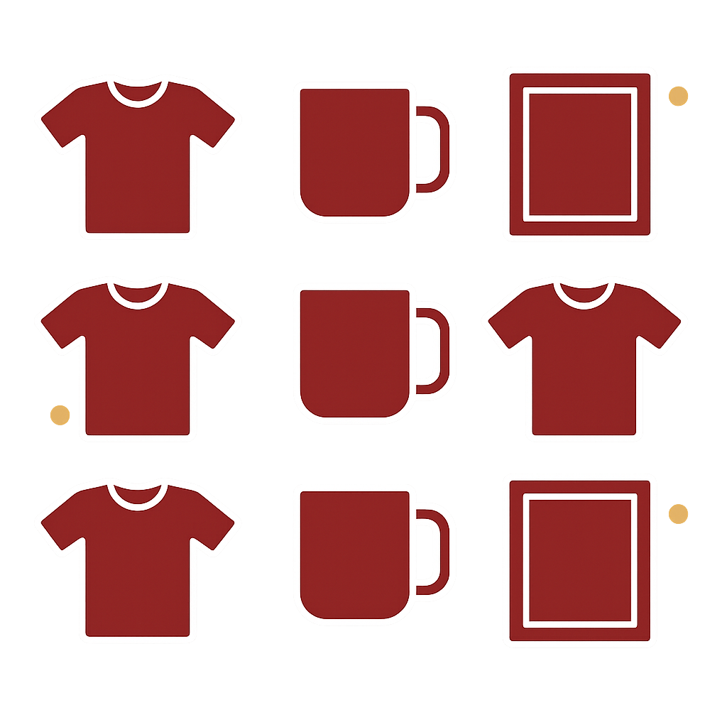
Step 4 — Upgrade Your Mockups
Strong visuals are the difference between “scroll past” and “add to cart.”
Consistency Builds Trust
Keep:
- The same style
- The same lighting
- The same framing
- The same overall aesthetic
Your shop should feel unified, not stitched together.
Make Thumbnails Mobile-Friendly
Most buyers browse on phones.
Your first thumbnail must be:
- Clear
- High contrast
- Easy to understand
- Free of clutter
- Legible at a glance
If the design can’t be understood instantly, they scroll away.
Level Up With PrintCube!
Simply use PrintCube for print on demand. Get started for free. No credit card or subscription required.
Sign Me Up!Remove Visual Noise
Avoid mockups with:
- Distracting props
- Busy scenes
- Hard-to-see angles
- Warped designs
Clarity sells.
Step 5 — Relaunch With Buyer-Focused SEO
This is where your leaner catalog becomes discoverable again.
Write Titles Buyers Actually Search
Use this structure:
Product Type → Design Theme → Who It’s For
Examples:
- "Funny Dog Mom Shirt – Golden Retriever Tee – Gift for Pet Lovers"
- "Retro Hiking Shirt – Mountain Graphic – Camping Gift"
- "Minimal Line Art Print – Neutral Modern Wall Art"
Strengthen Thumbnails + Collections
- Use clean, consistent mockups
- Link items with "more from this series"
- Keep buyers browsing longer
Longer sessions = better ranking = more sales.
Quick Maintenance Tips
- Audit monthly
- Archive slow performers
- Add new designs only if they fit your winners
- Refresh thumbnails twice a year
Small, steady upkeep keeps your shop sharp.
Conclusion
A bloated catalog doesn’t impress buyers—it overwhelms them.
A tight catalog feels intentional, professional, and trustworthy. It helps your best designs shine and makes your entire shop easier to navigate and easier to love.
Slim your catalog. Elevate your brand. Sell more—with less.
FAQ
1. Will removing listings hurt my shop?
Removing low-engagement listings usually helps your overall performance.
2. What’s the ideal catalog size?
Most strong POD shops thrive with 12–20 listings.
3. Delete or archive?
Archive if you may revisit the design later.
4. What impacts conversions most?
Thumbnails and mockups.
5. Do variants count against me?
No—variants don’t hurt catalog clarity.
Level Up With PrintCube!
Simply use PrintCube for print on demand. Get started for free. No credit card or subscription required.
Sign Me Up!